Continuing the journey: our new mascot and wordmark
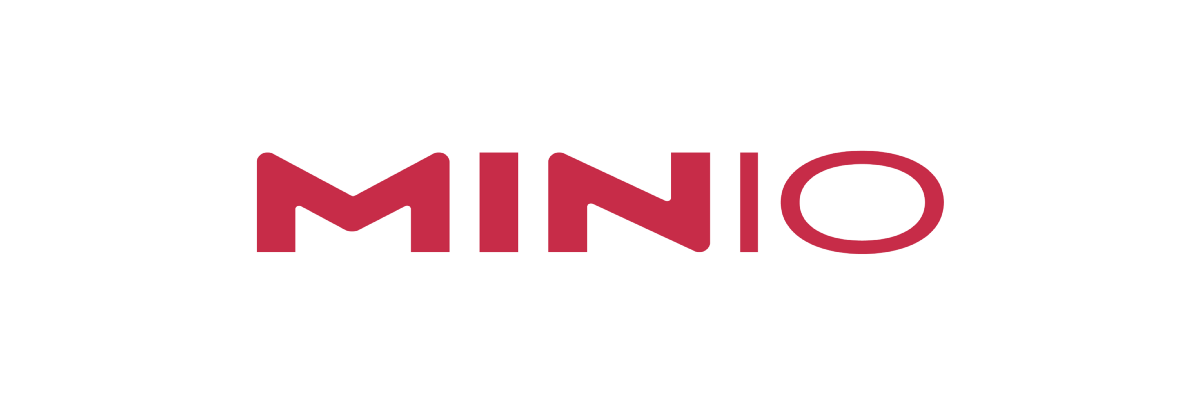


We are excited to introduce our new wordmark and mascot. We will use the wordmark as our new logo and the bird will become the MinIO mascot.
The new wordmark and mascot reflect the voice of our community. Most call us min·eye·oh instead of mini-o and so we chose to reflect that pronunciation in the wordmark. The second change was to make our mascot more simple by making it single color. This again was inspired by something we saw in a community presentation last year.
While the changes are not major, they were undertaken with a great deal of thought and consideration. Our goal was to create something that offered us, and the community at large, fewer challenges, more flexibility and, in keeping with our underlying philosophy greater simplicity.
When we started the company back in Nov 2014, we were looking for a logo which combined “life” with our philosophy of minimalism. After searching through countless logos (partly because all the mammals are already taken by other open source projects) we came across the work by artist George Bokhua. The simple straight line of the bird immediately struck a chord with us. The bird was strong, elegant but still minimal.
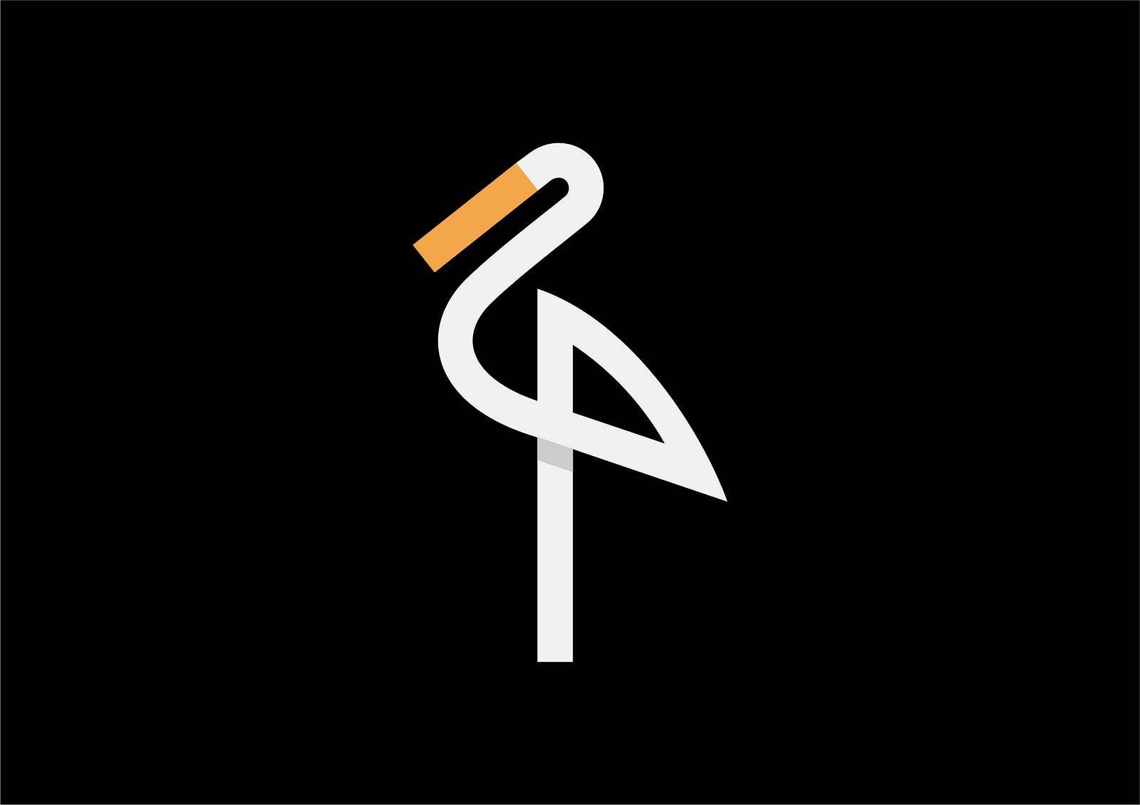
George Bokhua refined the bird even further refined the mark creating a beautiful, tall and elegant single stroke of a stork.
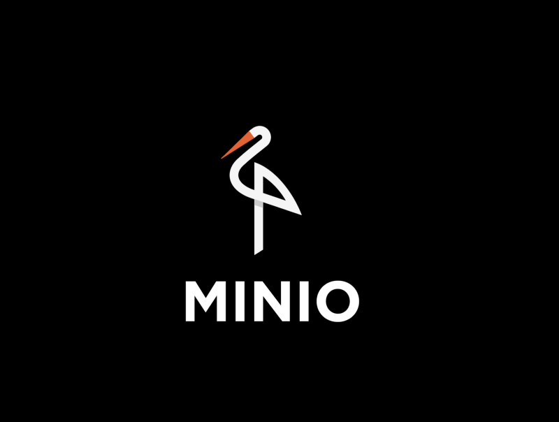
As we started working with the logo we experienced a number of challenges. George had warned us of these issues, but we were star struck and proceeded anyway.
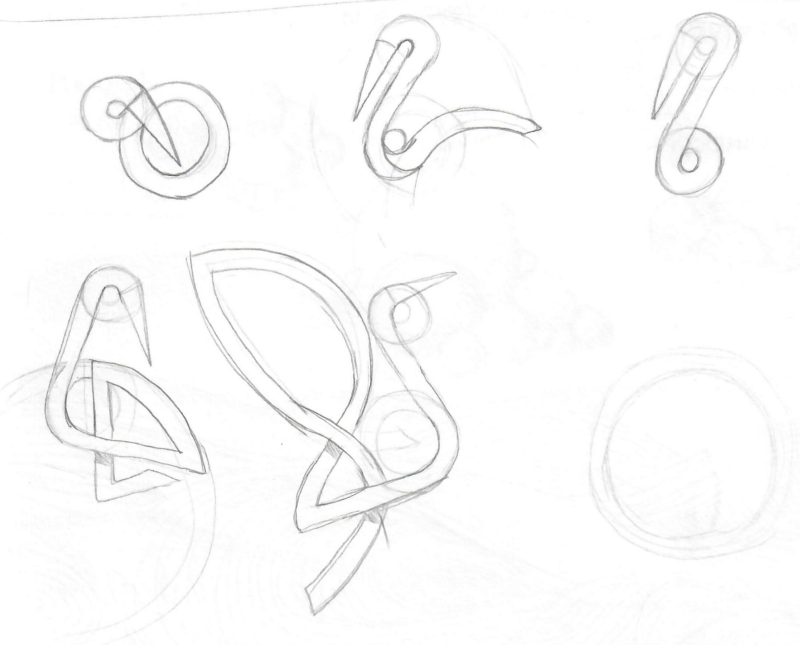
Specifically, the stork commands all the attention and cannot be used with the wordmark. Further, the thinness of the bird needed it to be of certain size making it difficult to place it on the website. To address this problem George Bokhua and our in-house design team worked on other variations of the bird as we sought to retain the timelessness and minimalism of the original logo.
Here are results of some of the exploration

After much back and forth, we chose a slightly refined, sleeker version — our second iteration.
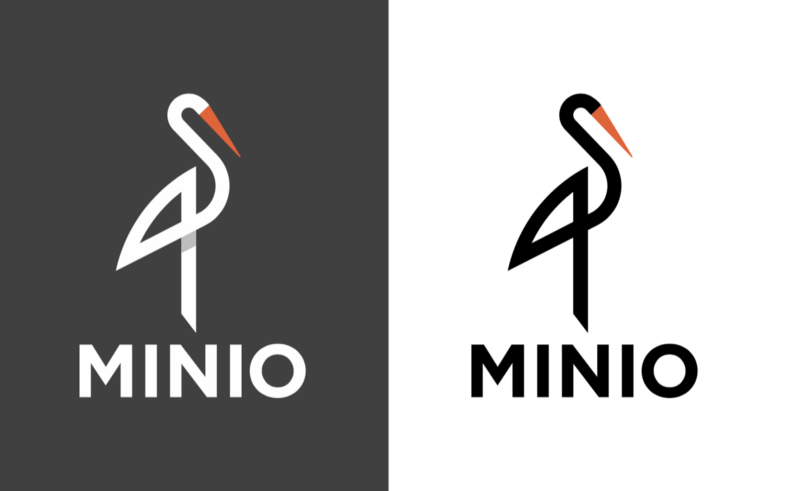
While an improvement, it did not solve for some of the challenges we experienced with the initial version.
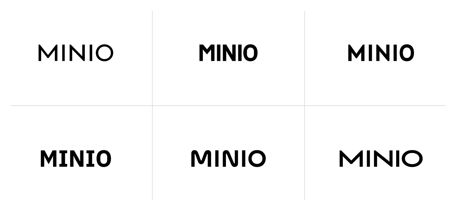
We realized at this point that we needed to separate the two. That meant using the bird as a mascot and focusing on the wordmark as the new logo. We worked with a new designer, Jessica Jones to help us with this process. Here are some examples of the exploration:

After a few more revisions, we arrived at the following. What we liked about it was that it really breathed life into the wordmark.
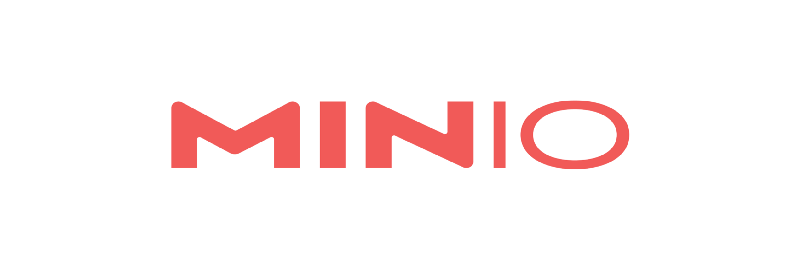
We were still conflicted on the color. While it was fun and vibrant, it lost its impact when used in smaller versions.
That is what led us to French Raspberry — it provided the the punch we were looking for without overwhelming.

We will start the transition to this new personality in the coming weeks so keep an eye on our website and social media channels. We hope you love these changes as much as we do!


